首页
技术小册
AIGC
面试刷题
技术文章
MAGENTO
云计算
视频课程
源码下载
PDF书籍
「涨薪秘籍」
登录
注册
媒体查询概念
@media常用参数
实例-div换行显示
媒体查询引入方式
媒体查询的引入方式2
什么是flex
flex-direction
flex-wrap
flex-flow
justify-content
align-items
align-content
子元素属性设置
flex特殊写法-简写
输入框布局
input对齐布局
rem布局
自适应布局
响应式布局
rem弹性布局
课程小结
当前位置:
首页>>
技术小册>>
Web响应式布局入门到实战
小册名称:Web响应式布局入门到实战
**什么是媒体查询?** 媒体查询又叫媒介查询,主要目的是为不同尺寸的屏幕设定不同的CSS样式。 示例代码: ``` <!DOCTYPE html> <html lang="en"> <head> <meta charset="UTF-8"> <meta http-equiv="X-UA-Compatible" content="IE=edge"> <meta name="viewport" content="width=device-width, initial-scale=1.0"> <title>媒体查询</title> <style> .div0{ width:200px; height:150px; border:1px solid red; } @media screen and (min-device-width:100px) and (max-device-width:300px){ .div0{ background-color: blue; } } @media screen and (min-device-width:301px) and (max-device-width:500px){ .div0{ background-color: green; } } </style> </head> <body> <div class="div0"> <p>div</p> </div> </body> </html> ``` 当屏幕尺寸在100-300之间,301-500之间,超过500,分别对其设置样式:  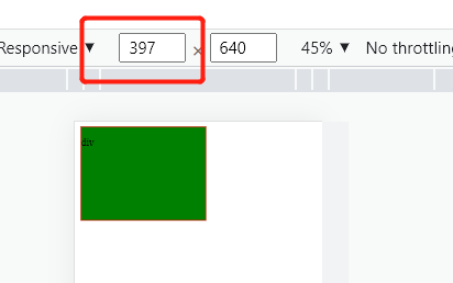 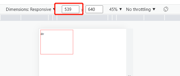
下一篇:
@media常用参数
该分类下的相关小册推荐:
uniapp快速入门与实战
vue高级应用开发与构建
web前端面试完全指南
WebGL开发指南