首页
技术小册
AIGC
面试刷题
技术文章
MAGENTO
云计算
视频课程
源码下载
PDF书籍
「涨薪秘籍」
登录
注册
媒体查询概念
@media常用参数
实例-div换行显示
媒体查询引入方式
媒体查询的引入方式2
什么是flex
flex-direction
flex-wrap
flex-flow
justify-content
align-items
align-content
子元素属性设置
flex特殊写法-简写
输入框布局
input对齐布局
rem布局
自适应布局
响应式布局
rem弹性布局
课程小结
当前位置:
首页>>
技术小册>>
Web响应式布局入门到实战
小册名称:Web响应式布局入门到实战
**布局特点:** - 不同设备对应不同的html - 局部自适应 **思路:** 判断设备的类型或控制局部的变化 示例一:判断设备类型,跳转以对应的页面 ``` <!DOCTYPE html> <html lang="en"> <head> <meta charset="UTF-8"> <meta http-equiv="X-UA-Compatible" content="IE=edge"> <meta name="viewport" content="width=device-width, initial-scale=1.0"> <title>index</title> </head> <body> </body> <script> var redirect = () => { // 判断设备类型 const isMobile = /Android|webOS|iPhone|iPad|iPod|BlackBerry|IEMobile|Opera Mini/i.test(navigator.userAgent); // 根据设备类型跳转到不同的页面 if (isMobile) { window.location.href = "mobile.html"; } else { window.location.href = "pc.html"; } } redirect(); </script> </html> ``` 示例二:局部自适应,两侧固定不变,中间弹性伸缩 ``` <!DOCTYPE html> <html lang="en"> <head> <meta charset="UTF-8"> <meta http-equiv="X-UA-Compatible" content="IE=edge"> <meta name="viewport" content="width=device-width, initial-scale=1.0"> <title>mobile</title> <style> #div0 { display: flex; } #div0 div:first-child { background-color: yellow; flex: 0 0 50px; } #div0 div:nth-child(2) { background-color: red; flex: 1; } #div0 div:nth-child(3) { background-color: yellow; flex: 0 0 50px; } /* 配合媒体查询效果 */ @media (min-device-width:400px) and (max-device-width:500px) { #div0 div:nth-child(2) { background-color: blue; flex: 1; } } </style> </head> <body> <div id="div0"> <div>1</div> <div>2</div> <div>3</div> </div> </body> </html> ``` 效果: 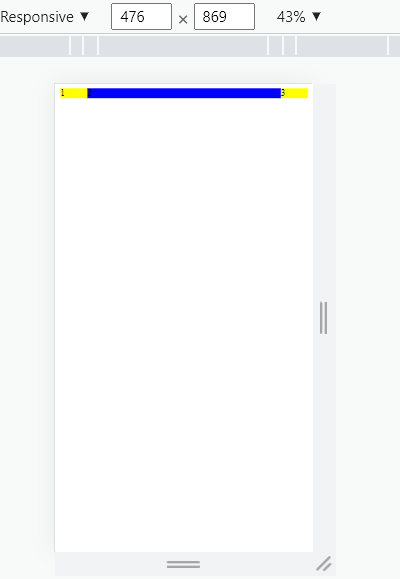
上一篇:
rem布局
下一篇:
响应式布局
该分类下的相关小册推荐:
web前端面试完全指南
vue高级应用开发与构建
uniapp快速入门与实战
WebGL开发指南