首页
技术小册
AIGC
面试刷题
技术文章
MAGENTO
云计算
视频课程
源码下载
PDF书籍
「涨薪秘籍」
登录
注册
媒体查询概念
@media常用参数
实例-div换行显示
媒体查询引入方式
媒体查询的引入方式2
什么是flex
flex-direction
flex-wrap
flex-flow
justify-content
align-items
align-content
子元素属性设置
flex特殊写法-简写
输入框布局
input对齐布局
rem布局
自适应布局
响应式布局
rem弹性布局
课程小结
当前位置:
首页>>
技术小册>>
Web响应式布局入门到实战
小册名称:Web响应式布局入门到实战
**布局特点:** 确保一个页面在所有终端上,都能显示出令人满意的效果。 一句话:一套方案处处运行。 **设计思路:** 使用%或rem作为单位实现。 代码示例: ``` <!DOCTYPE html> <html lang="en"> <head> <meta charset="UTF-8"> <meta http-equiv="X-UA-Compatible" content="IE=edge"> <meta name="viewport" content="width=device-width, initial-scale=1.0,user-scalable=no"> <title>Document</title> <link rel="stylesheet" href="big.css" media="(min-device-width:1000px)"> <link rel="stylesheet" href="small.css" media="(min-device-width:400px) and (max-device-width:600px) "> </head> <body> <div id="layout"> <div id="top"> </div> <div id="main"> <div> <li>分类1</li> <li>分类2</li> <li>分类3</li> <li>分类4</li> <li>分类5</li> <li>分类6</li> </div> <div> <li>图片</li> <li>图片</li> <li>图片</li> <li>图片</li> <li>图片</li> <li>图片</li> <li>图片</li> <li>图片</li> </div> </div> </div> </body> </html> ``` big.css: ``` *{ margin: 0; padding: 0; background-color: #f5f5f5; } #layout{ display:flex; flex-direction: column; width: 80%; /* pc端的宽度,可以设置为当前视口的百分之80或90 */ margin: 0 auto; } #top{ width:100%; flex:0 0 50px; margin: 0 auto; background-color: yellow; } #main{ flex: 0 0 100%; display: flex; } /* 分类样式 */ #main div:nth-child(1){ flex: 0 0 10%; background-color: #f5f5f5; list-style-type: none; display: flex; flex-wrap:wrap; border-left:1px solid white; border-right:1px solid white; } #main div:nth-child(1) li{ flex: 0 0 100%; height:40px; line-height: 40px; text-align: center; border-bottom:1px solid white; } /* 右边部分 */ #main div:nth-child(2){ flex: 0 0 90%; background-color: #f5f5f5; list-style-type: none; display: flex; flex-wrap:wrap; justify-content: space-around; } #main div:nth-child(2) li{ flex: 0 0 30%; height:120px; text-align: center; border-bottom:1px solid white; background-color: yellow; margin-top:10px; } ``` 实现效果:  移动端: small.css: ``` *{ margin: 0; padding: 0; background-color: #f5f5f5; } #layout{ display:flex; flex-direction: column; width: 100%; /* 移动端占100% */ margin: 0 auto; } #top{ width:100%; flex:0 0 50px; margin: 0 auto; background-color: yellow; } #main{ flex: 0 0 100%; display: flex; flex-wrap: wrap; } /* 分类样式 */ #main div:nth-child(1){ flex: 0 0 100%; /* 分类占100% */ background-color: #f5f5f5; list-style-type: none; display: flex; flex-wrap:wrap; border-left:1px solid white; border-right:1px solid white; align-content: flex-start; } #main div:nth-child(1) li{ flex: 0 0 30%; height:40px; line-height: 40px; text-align: center; border-bottom:1px solid white; } /* 右边部分 */ #main div:nth-child(2){ flex: 0 0 100%; background-color: #f5f5f5; list-style-type: none; display: flex; flex-wrap:wrap; justify-content: space-around; } #main div:nth-child(2) li{ flex: 0 0 30%; height:120px; text-align: center; border-bottom:1px solid white; background-color: yellow; margin-top:10px; } ``` 实现效果: 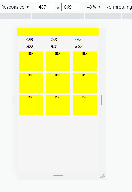 **优化方式:** 将big.css和small.css中公共的代码分离出来为common.css。 而区分宽度的地方,分别写在big.css和small.css文件里。
上一篇:
自适应布局
下一篇:
rem弹性布局
该分类下的相关小册推荐:
uniapp快速入门与实战
WebGL开发指南
vue高级应用开发与构建
web前端面试完全指南