首页
技术小册
AIGC
面试刷题
技术文章
MAGENTO
云计算
视频课程
源码下载
PDF书籍
「涨薪秘籍」
登录
注册
媒体查询概念
@media常用参数
实例-div换行显示
媒体查询引入方式
媒体查询的引入方式2
什么是flex
flex-direction
flex-wrap
flex-flow
justify-content
align-items
align-content
子元素属性设置
flex特殊写法-简写
输入框布局
input对齐布局
rem布局
自适应布局
响应式布局
rem弹性布局
课程小结
当前位置:
首页>>
技术小册>>
Web响应式布局入门到实战
小册名称:Web响应式布局入门到实战
当子元素为多行的时候,align-items不能同时处理多行,只能针对每一个子元素来处理。 如下面的示例,当父元素宽度不够,并且设置为wrap时,此时使用align-items,效果如下: ``` <style> #div0{ width:380px; background-color: violet; display:flex; flex-wrap: wrap; height:400px; align-items: center; } #div0 div{ width: 100px; height: 100px; background-color: yellow; } </style> </head> <body> <div id="div0"> <div>1</div> <div>2</div> <div>3</div> <div>4</div> </div> </body> ``` 效果: 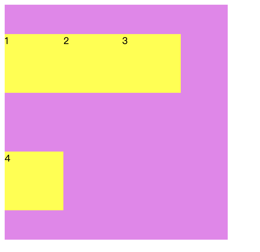 **align-content:** 作用 设置每个flex元素在交叉轴上的默认对齐方式 ``` <style> #div0{ width:380px; background-color: violet; display:flex; flex-wrap: wrap; height:400px; align-content: center; } #div0 div{ width: 100px; height: 100px; background-color: yellow; } </style> </head> <body> <div id="div0"> <div>1</div> <div>2</div> <div>3</div> <div>4</div> </div> </body> ``` align-content将子元素作为一个整体,在交叉轴居中。 效果: 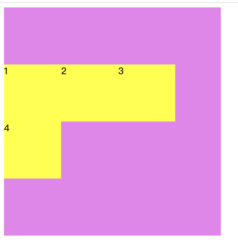 **align-content属性值** | 属性值 | 作用 | | :------------ | :------------ | | flex-start | 默认值,子元素x轴方向,左对齐 | | flex-end | 子元素x轴方向,右对齐 | | center | 居中显示 | | space-between | 当父元素有剩余空间时,子元素平均分布在该行上,两边不留间隔空间 | | space-around | 当父元素有剩余空间时,子元素平均分布在该行上,两边留有一半的间隔空间 |
上一篇:
align-items
下一篇:
子元素属性设置
该分类下的相关小册推荐:
uniapp快速入门与实战
WebGL开发指南
vue高级应用开发与构建
web前端面试完全指南